Traditional Family Room and Kitchen with a Boho Vibe
Hey y’all! I bought my house a couple years ago because it was light, bright, and happy. My previous home was very grand, but it was dark, over the top, and it just never felt like me. My girls and I needed a new house and I knew I wanted something super open, yet totally cozy and full of natural light. What I love about this house is that it has windows all along the kitchen and family room and the giant sliding door opens to the backyard, creating a large indoor/outdoor space. The house has a very clean and open look. While I usually prefer antiques and vintage wood flooring this house was new and a perfect fit for us at the time when we purchased it. It's a traditional cape cod that I added my casual boho style to. I brought in antique furniture and accessories and paired those items with modern furniture, boho pillows and some moroccan rugs.
I'm not into the hot pink new millennial trend of turquoise furniture and baby pink walls, pastel kitchens, and bright colored doors. I see this trend all over Instagram and it's just not my style. I'm very much into neutral colors, a lot of white, with pops of black and overall, just a more minimal clean look. I’m really a believer in high-low as well, meaning I like to pair an expensive rug or antique with a less expensive piece of furniture or vice versa. I think it's important to mix your pieces so everything isn't so matchy-matchy. I haven’t totally finished the house yet and I’m in need of art, but it’s fun to add, take away, and change things over time. Scroll down to see all the before and after shots of my living room, dining, kitchen, and entry. I will post some of the other before and after shots of other rooms in a separate post, but if you have questions on anything in this post please leave a comment or email me!
The Living Room Before
This is what the living room looked like when I bought the house. It had staged furniture, no window coverings, and contemporary chrome light fixtures.
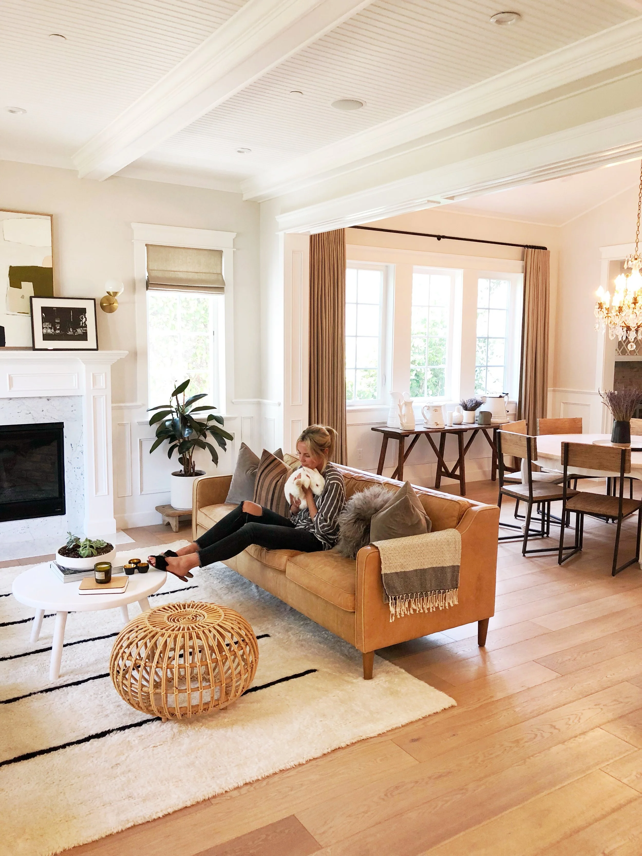
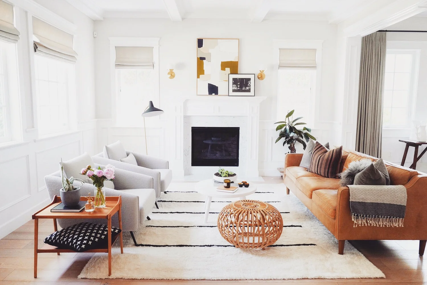
The Living Room After
I changed out the faux silver crystal sconces to minimal brass fixtures, added neutral custom linen curtains, dark iron curtain rods, and played a little game of high-low with my furniture. The Névé rug is more pricey and it's from Design Within Reach, but I paired it with a leather couch I fell in love with from West Elm and two more expensive modern side chairs from Design Within Reach. The coffee table was a custom resin piece from Tina Frey Designs and the ottoman is from Sika-Design. The pillows are all from Amber Interiors (minus the Icelandic fur pillow) which is from an Etsy shop in Poland. The side table is an antique from Mid Century Design that I had refinished and the cool plant stand is an antique from Morroco. All the pottery is from Wild Flora Design. The chandelier over the marble dining table is an antique from Italy and the Gubi lamp is from Danish Design.
The Foyer Before
When I purchased the house there was a wine cellar in the hallway when you entered the house. I didn't love the location of it and it wasn't temperature controlled so I removed the wine cellar and walled it in and created a much larger walk-in pantry on the other side. I ultimately need more food than I did wine, so it was something that made sense for me.
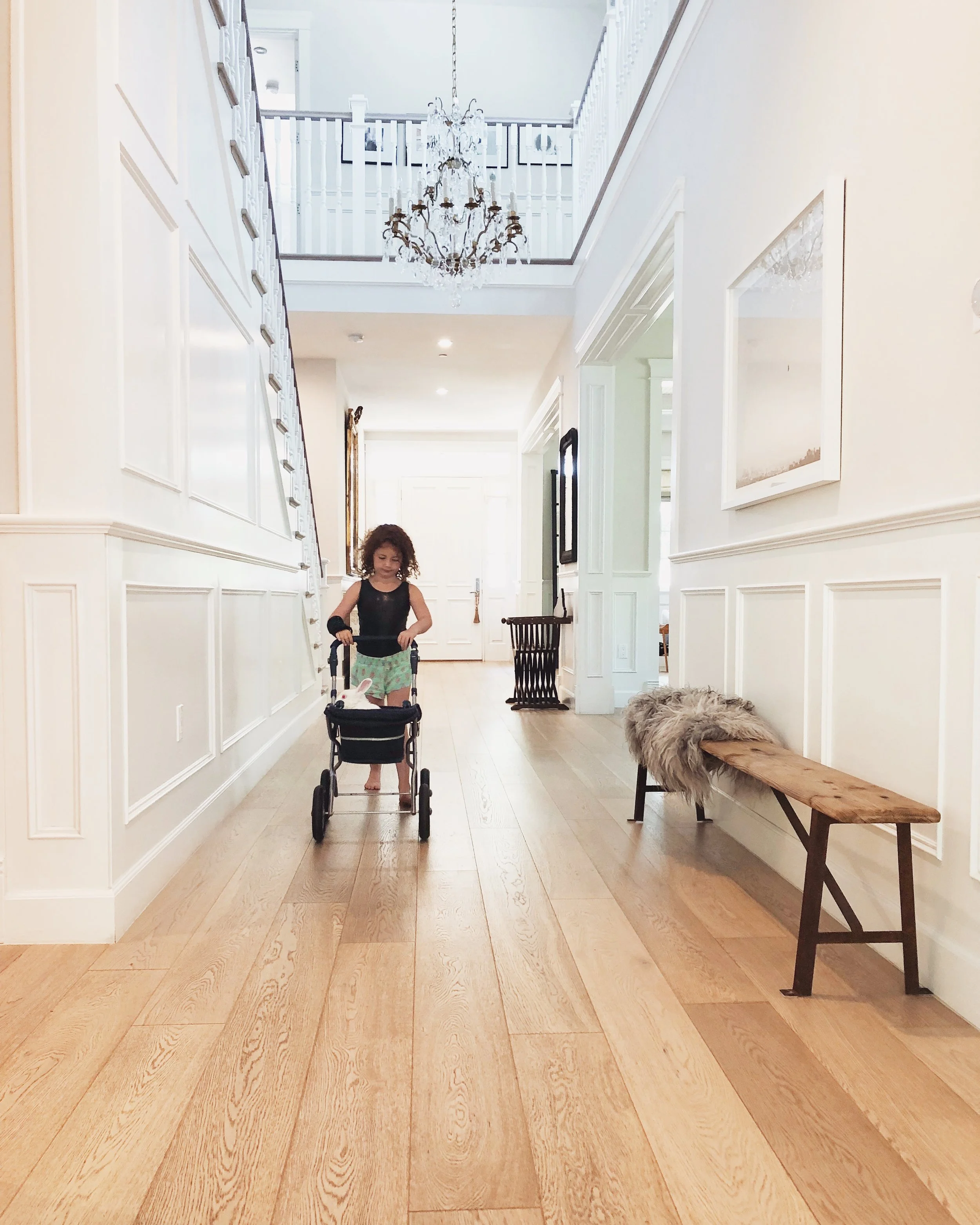
The Foyer After
The bench is an antique and the Icelandic furs are from the same Etsy shop in Poland. The photograph is from Mid Century Design and the Moroccan chair is an antique as well. Olive is from me :)
The Kitchen Before
The Kitchen After
I loved the kitchen being bright and white, but I wanted more of a contrast and I thought the dark counter top on the back would look better paired with dark cabinets so I changed the lower cabinets from an off white to a Sherwin Williams midnight gray. I left the island cabinets white, because the marble was white.
The light fixtures were changed out and I replaced them with white Muuto pendants which you can find here.
I changed all the silver hardware to natural brass and I purchased everything from School House Electric. The hardware is not cheap, but it's pretty and very durable. I changed out the hardware in my entire house. I linked everything below.
1 inchRiverwood knobs
Natural Brass Middle Pulls
I didn't want to add too much brass, because I think it can look overdone when people do all silver or all brass so I changed the sink faucets from silver to matte black, as well as the garbage disposal buttons, pot filler, and soap dispenser. It's harder than you think to find everything matching in matte black or flat black so in case you want to do the same I linked everything below as well. I added antique bowls, step stools, and vases to bring in some character.
Newport Brass Flat Black Pot filler
Newport Brass Flat Black Soap Dispenser
Insinkerator Matte Black Garbage Disposal Buttons
Newport Brass Flat Black One Handle Kitchen Faucet
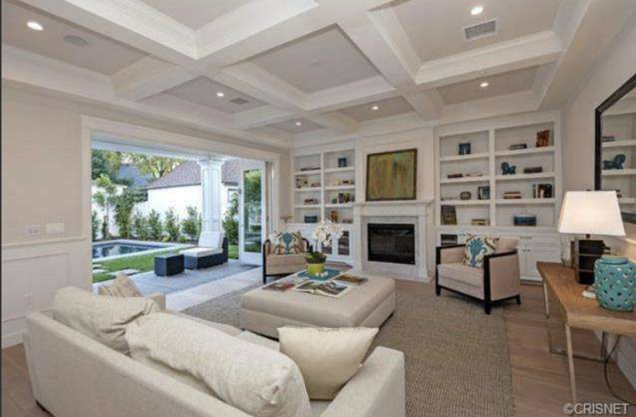
The Family Room Before
This is what the family room looked like when I purchased the house. It was staged so there was minimal furniture, but obviously with a family I needed two couches and a real coffee table. I left the colors the same and added curtains and larger furniture.
The Family Room After
The family room is still a work in progress for me. I still need to finish the art on the wall and add some items to the bookshelf, but that takes time and changes all the time to be honest. The couches are the cloud couches from Restoration Hardware and the oversized coffee table is from Restoration Hardware as well. The pillows are quite expensive unfortunately as they are all custom or mostly vintage pillow covers from Amber Interiors. The resin bowl I had made for me by Tina Frey. She has some amazing pieces online and she sells in Barney's as well. All her stuff is very minimal and I think one key piece goes a long way in the room. Feta's bed is a vintage blanket from Morroco that I had made into a poof. All the crates on the bookshelf are antiques as are most of the items on the bookshelf. Since the couches and table were new I wanted to make sure I had antiques and other cool items in the room so it didn't look like a RH catalog. The modern black grasshopper lamp is from Danish Design. And I’m still trying to figure out what rug I want to do ** And for the 235 people who have messaged me about the white couches, they are slip covered so you can literally just pull off the covers and the pillow cases and wash everything. And I do regularly because I'm a clean freak with two kids!
And the Little Nook by the Garage
This is where all our shoes pile up so I kept it clean and simple. I changed out the hardware to match everything else from School House Electric and I put two custom linen pillows on the bench and a clean, modern print on the wall. I also added a wall hook so the kids can hang their backpacks and belongings for school.
Hope you enjoyed the little home tour. Next week I will post the powder bath before and after! Let me know what you think in the comments below! Xx


